%20(1).png)
Style I'm loving right now: Contemporary Cottage Charm
My picks for combining whimsy with sleek in your home for a perfectly charming vibe
This post contains affiliate links, which means I may earn a small commission if you make a purchase through them—at no cost to you. I only share products I truly love or use in my own home.
I’ve been slowly updating our small family home since we realized we were going to be living here longer than originally anticipated due to our incredible 2019 interest rate and an overly competitive real estate market. My style when we moved into our home in 2019 was a mix what was trending at the time (hello farmhouse) random college leftovers, hand-me-down furniture, and black and gold everything. But here in 2025, with two kids and a clearer sense of what feels like us, my style has matured. I’ve been craving more character, more pattern, more color—elements that make our home feel collected but also very intentional.
Somewhat unintentionally, this craving has led me to cottagecore elements like patterned wallpaper, floral linens, and wood accents. The aesthetic has been everywhere the past few years, and I guess my home is just now catching up. But my version isn’t full-on countryside fairytale—it's more cottage charm with a modern twist. I love combining contemporary details like geometric patterns and silhouettes with playful florals and colors. Today I’m sharing some recent finds that feel perfectly in line with that vibe—pieces that blend charm, whimsy, and just enough structure to feel fresh.
You don’t have to redo your whole house—sometimes a little charm in the right corner goes a long way.

For the Bathroom

Part of Sarah Sherman Samuel’s beautiful collection for L&G, this bath mat brings that more contemporary edge to the cottage charm style. It’s still playful but the color blocking of the checkered pattern adds a geometric layer to a space.

The striped towel edges combined with floral print are just perfection - and the colors are beautiful.
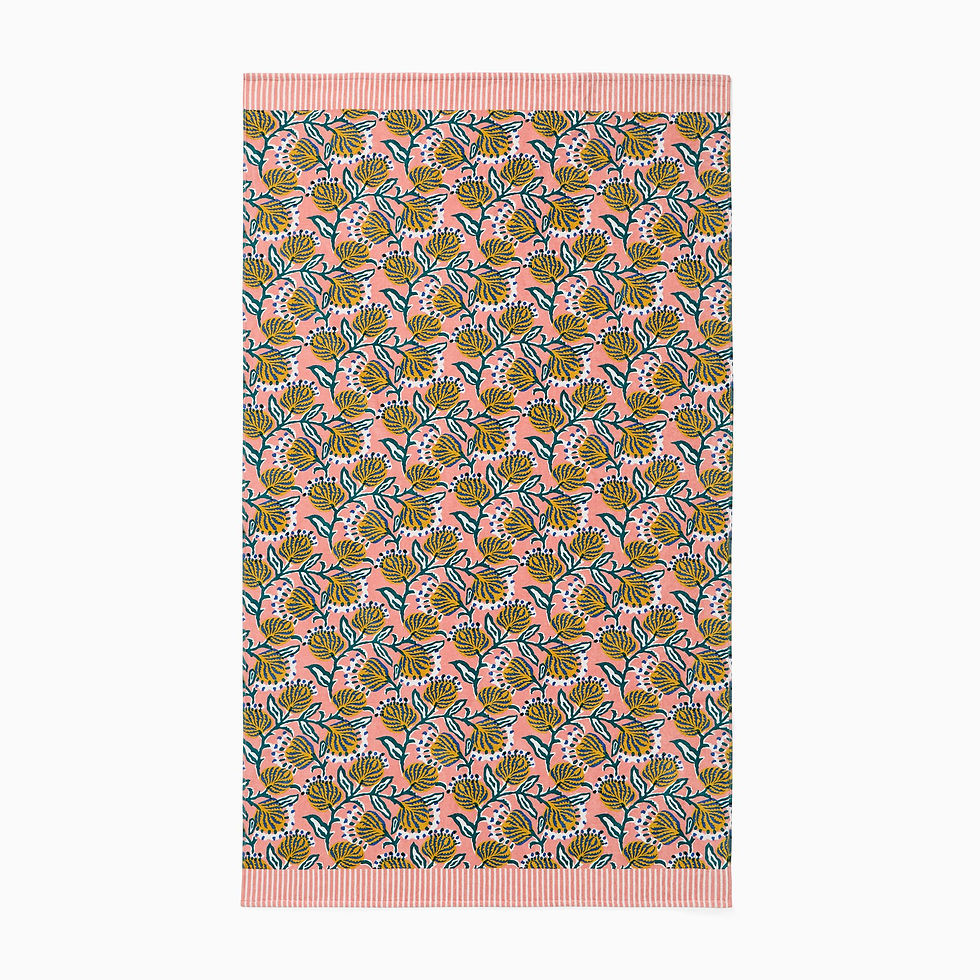
I love beach towels - I’m not usually a huge color person but I love that beach towels can kind of just do their own thing and don’t need to match with a space or vibe - they’re just for fun. And these have that floral / stripe combo I’m loving.
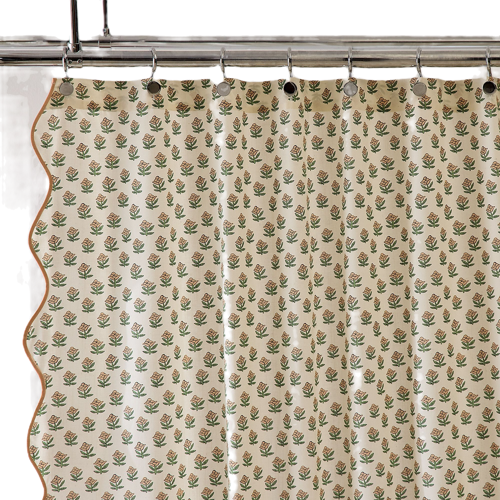
The playful floral print comes in 3 color variations and the scallop edge detail is the icing on the cake!
For the Bedroom

If you haven’t noticed West Elm is completely embodying this contemporary cottage charm thing I’m loving. Patterned sheets just feel fancy and fun– and these floral patterned sheets have striped ruffles on the edges! The cutest little detail.
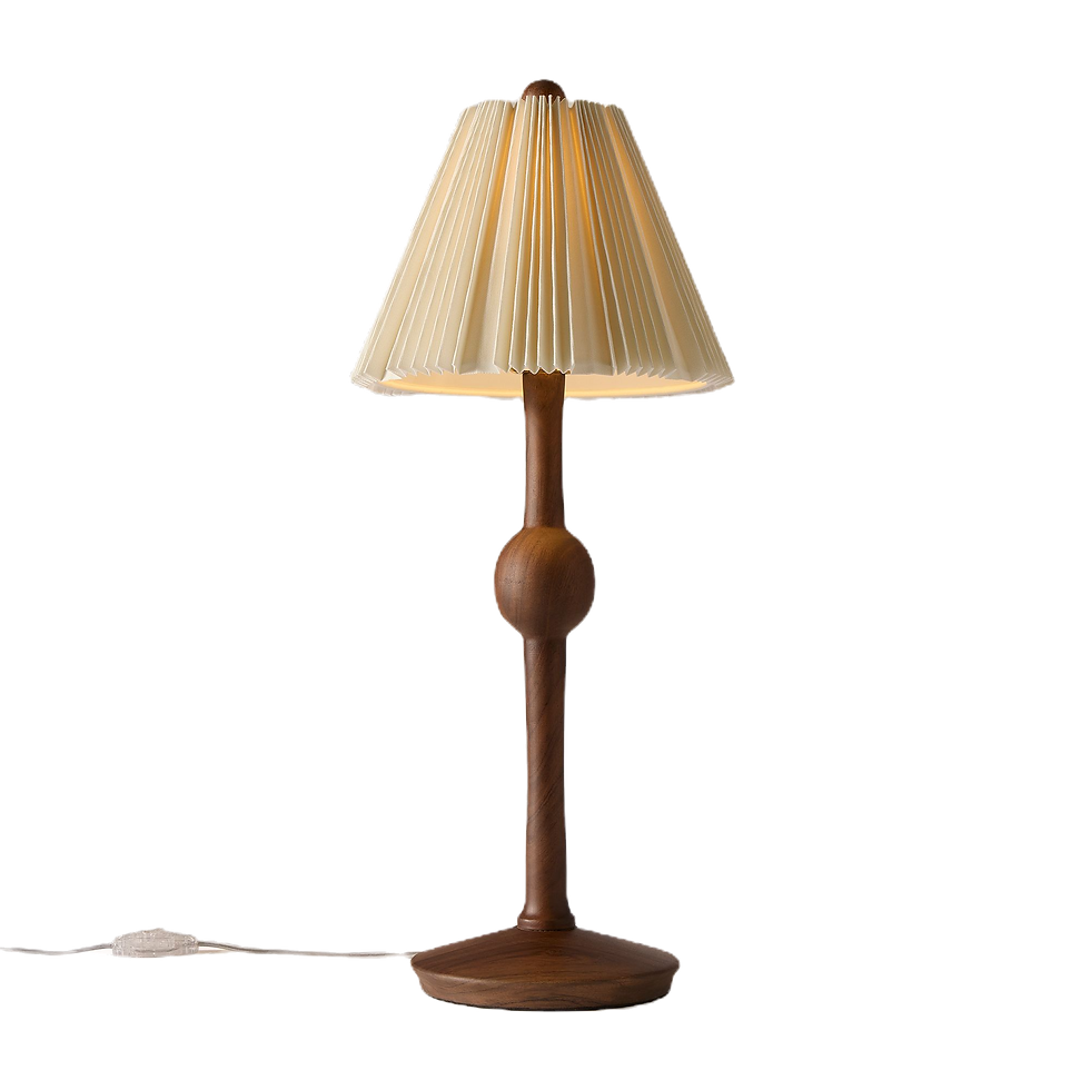
The beautifully structured pleated shade totally makes this lamp, but I love the wooden base that brings in just a touch of cottage-rustic-charm. We use these in our bedroom on our nightstands.
Blue floral block print and Red and blue floral print Lulu & Georgia Linen Pillows |
These pillows come in beautiful earthy colors and pair well together for some fun but sophisticated pattern mixing.

OK is the floral x stripes detail getting old here? I think not! I’m obsessed with this rug - it was a perfect piece for our primary bedroom. It comes in multiple sizes but I love this small-ish size for just a pop of color and pattern in a bedroom.
For the Dining Room

Great price and so many great prints and colors to choose from to add a feminine touch to your dining table.
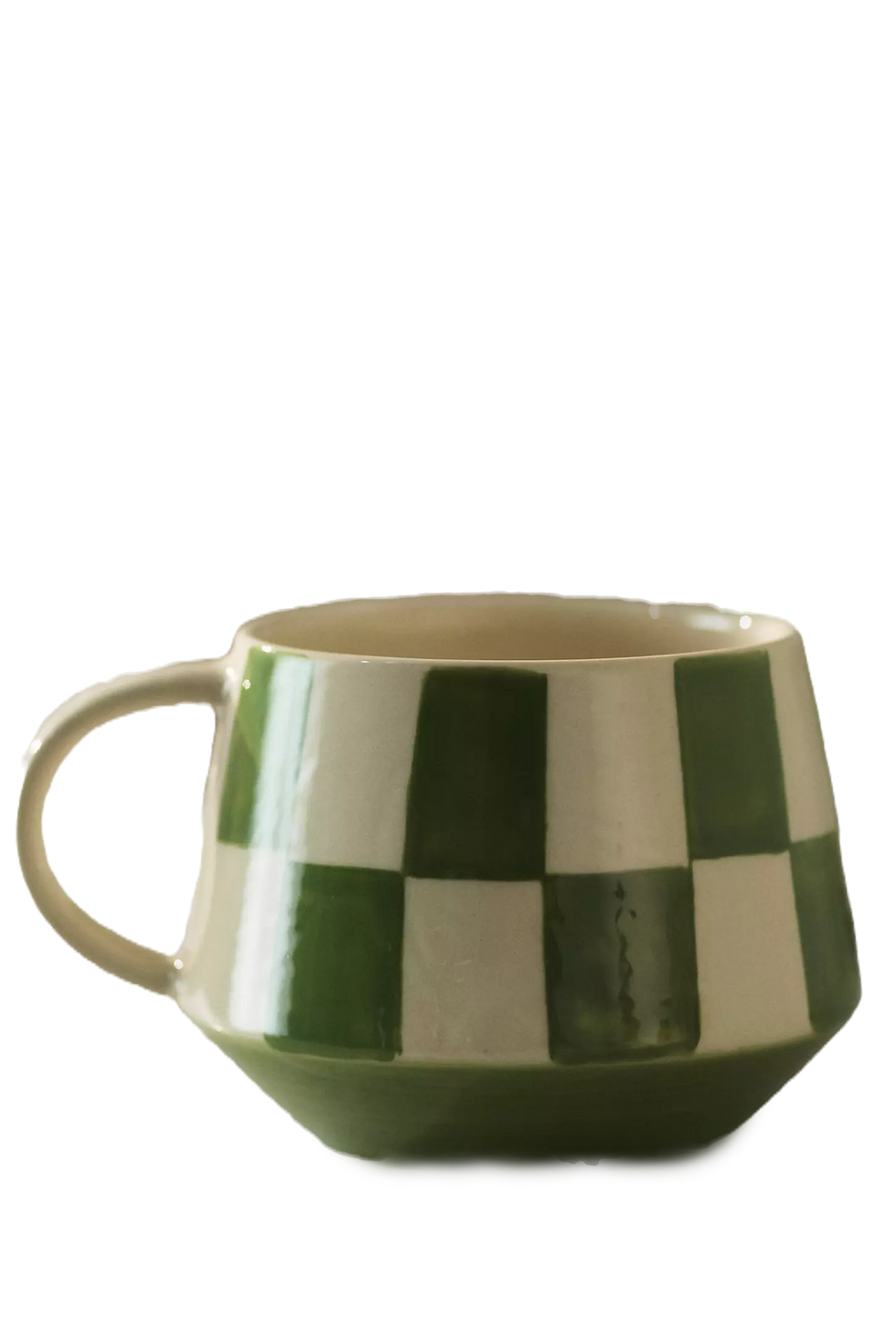
Do I need more coffee mugs? No. But who doesn’t love sipping their coffee every day in a cute mug. Just elevates the experience! The checkered pattern on these comes in the best colors.
If the product has wiggle in the name, sign me up! Love the shape of these plates and again some fun colors to start a conversation at your next dinner party.
Accents for the Home

A perfect statement frame to add to a shelf for styling or a nightstand or a dresser. The floral detail and colors are pure charm.

A checkered pattern is so versatile which is why I love incorporating it into the cottage charm look. It adds pattern and color while also creating opportunities for simple pattern mixing.

The scalloped edge + stripes + playful colors on these create a fun, high end cottage vibe. Not to mention the amazing scents! Super fresh for summer.

I love when pattern shows up on pieces that wouldn’t normally have them - like these taper candles. The handpainted detail adds a touch of whimsy and color.

I’ve had these for awhile. I love that they give taper candles contemporary spin with their sleek and simple lines. They’d look amazing with the handpainted Anthro candle holders above!

Yes, more checkers. To me a checkered pattern exudes cottage vibe without being stuffy. Love the green color with the neutral white base - will be the perfect vessel for any bouquet.
Fin
If you’re drawn to the warmth and whimsy nature of the cottagecore lewk but also like a sleek contemporary vibe, I hope the above recommendations help and inspire you! It’s all about layering the charm with geometric patterns and simple silhouettes.


fly88 thì mình cũng hơi nghi ngờ như mấy nền tảng giải trí online khác thôi, nhưng lướt thử vài phút thấy trang này trình bày khá dễ theo dõi; kiểu các khối thông tin tổng quan và điểm nổi bật được cắt ngắn vừa đủ, mình đọc lướt vẫn nắm ý chứ không phải kéo mãi, nên dù đang bận vẫn không thấy khó chịu, bấm qua lại giữa mấy mục cũng phản hồi nhanh, không gặp cảnh đứng chờ load lâu như vài chỗ mình từng dùng; mình để ý phần giao dịch họ nhấn mạnh tốc độ xử lý nhanh và ổn định, nghe thì ai cũng nói vậy nhưng ít nhất cách họ đặt nội dung…
https://kubet.latino/ ừ thì mình cũng kiểu lướt cho biết thôi. Hôm qua đang rảnh tay mình vào thử, tưởng sẽ loằng ngoằng như mấy trang cùng kiểu mà hóa ra bố cục lại dễ nhìn hơn mình nghĩ; kéo xuống là thấy các khối nội dung đặt rõ ràng, tiêu đề to nên mắt bắt được ngay mình đang đọc phần gì, không cần phải bấm qua lại nhiều mới hiểu. Mình để ý họ có nhắc kho trò chơi hơn 150 cái, và cách trình bày theo từng sảnh nhìn phát là phân biệt được, kiểu mình chỉ xem lướt cũng hình dung được chỗ nào là game bài hay mấy mục giải trí khác, đỡ mất công mò.…
PG55 là trang mình mở lên và thấy họ đặt mấy phần “thông tin cơ bản” khá rõ ngay từ đầu, đọc lướt vài dòng là nắm được họ đang nói gì mà không phải mò menu nhiều. Mình chỉ xem giao diện với bố cục thôi. Các khối nội dung nhìn gọn, khoảng cách chữ ổn nên kéo xuống đỡ mệt mắt. Có đoạn họ nói nền tảng hoạt động lâu năm và lượng truy cập mỗi ngày khá lớn, nghe thì để đó chứ mình cũng chỉ ghi nhận vì họ dám ghi thẳng số liệu. Mình thích kiểu trình bày đơn giản như vậy. Không cần màu mè quá. Phần nói về giấy phép độ minh bạch…
https://tg88com.io/ mình ghé thử do thấy mọi người nhắc nhiều, kiểu vào xem giao diện ra sao thôi. Vừa mở lên thấy trang chia nội dung theo từng khối khá rõ, nhìn thoáng mắt nên lướt nhanh không bị rối. Mình có đọc qua đoạn tổng quan về thương hiệu, họ viết theo kiểu kể quá trình hình thành rồi nói luôn định hướng dài hạn, nên dù không ngồi đọc kỹ vẫn nắm được ý chính. Mấy tiêu đề đặt nổi bật, kéo xuống là biết đang ở phần nào chứ không bị “dính” chữ liền một cục. Menu cũng nằm chỗ dễ thấy, bấm qua lại giữa các mục khá mượt, không phải mò. Nói chung mình thích…
https://sv368link.online mình lướt thấy trên group nên vào xem thử, kiểu tò mò thôi. Giao diện nhìn khá thoáng, nội dung chia thành từng khối nên kéo xuống không bị ngợp, đọc lướt vẫn bắt được ý chính. Mình để ý đoạn họ nói về hoàn trả đá gà, giải thích theo kiểu tính theo tổng thua lũy kế trong tuần nên dễ hình dung hơn, không phải tự ngồi cộng từng trận. Mấy tiêu đề về link chính thức với phần ưu đãi được làm nổi bật, nhìn phát biết đang ở mục nào. Menu bấm qua lại cũng ổn, chữ không quá dày nên đỡ mỏi mắt. Nói chung trang này làm phần heading và khung nội dung…